CONTEXT
The Brief
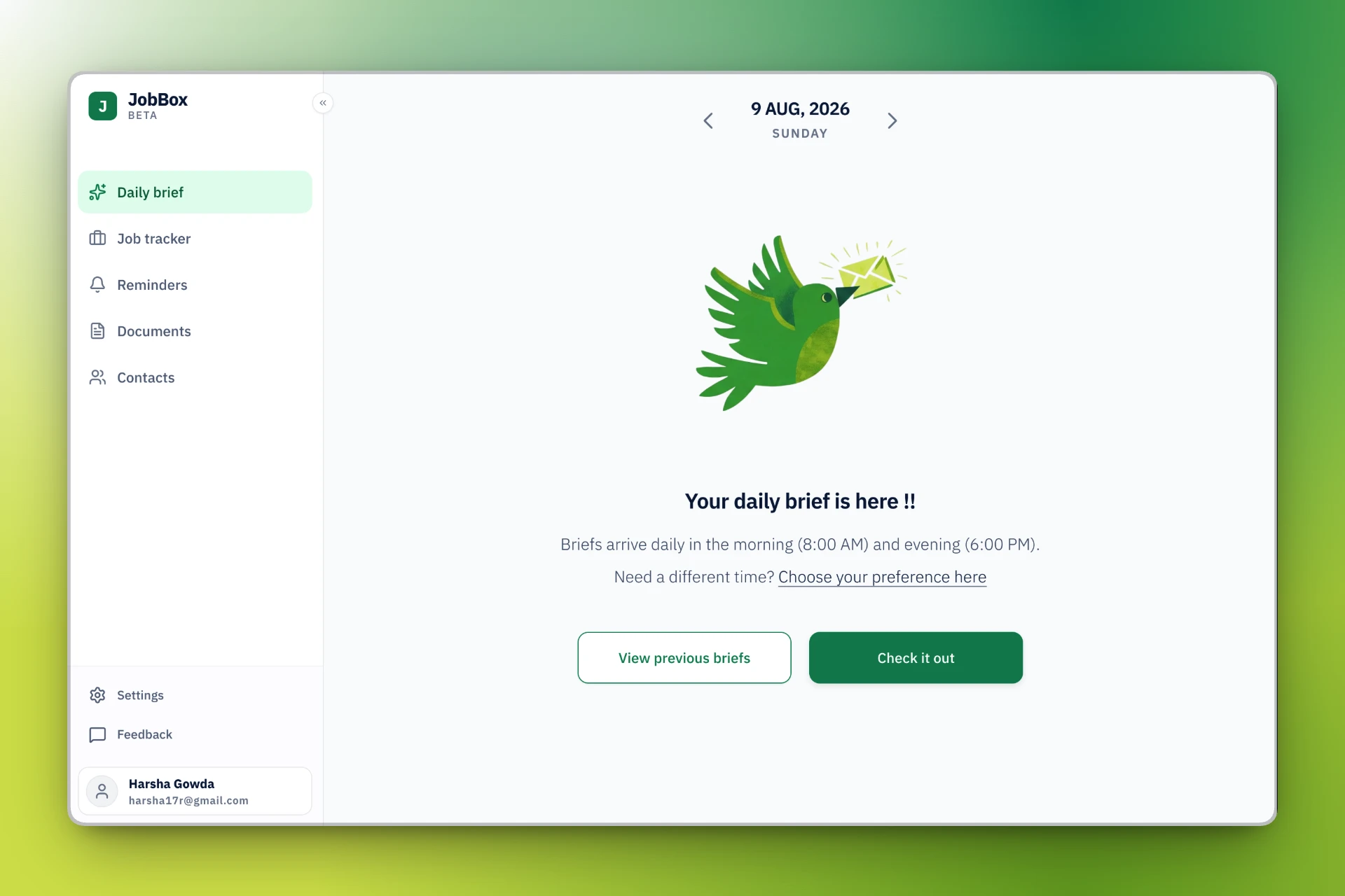
JobBox is a platform that centralizes the job search experience. It connects to Gmail, pulls in alerts from major job platforms, and organizes them into a single dashboard.
The JobBox founders started with a simple question:
If this is a job tracker, what should it actually look like?
And if it's meant to feel like an inbox for jobs, how should jobs show up and be handled?
PROBLEM
Job seekers are drowning, not searching.
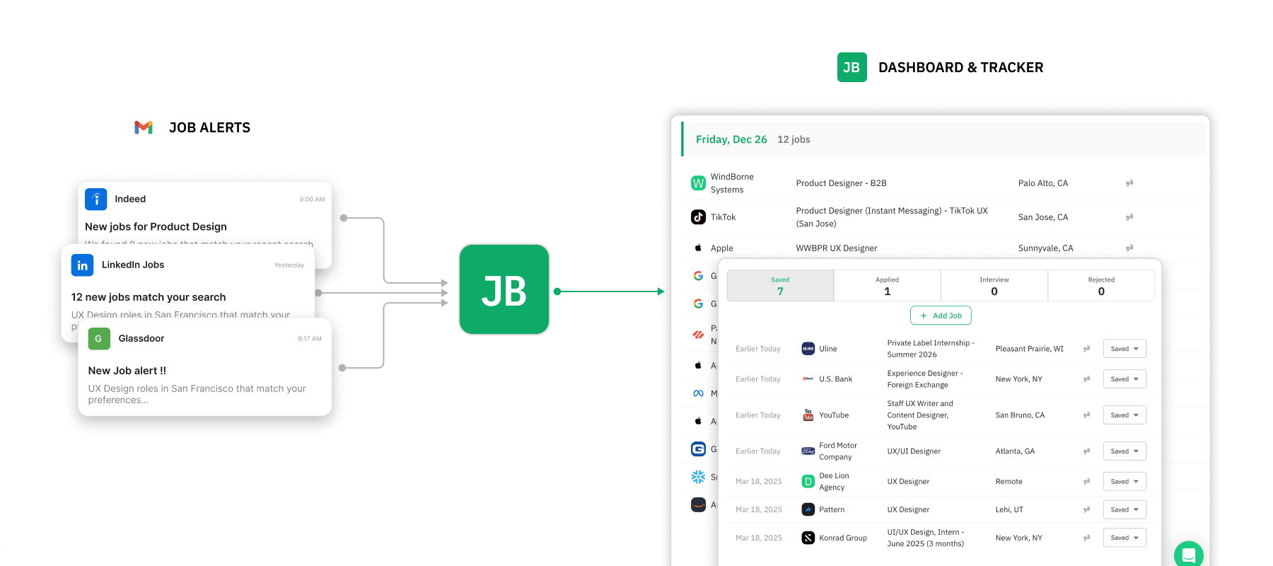
LinkedIn alerts. Indeed notifications. Glassdoor updates. Recruiter emails. All scattered across inboxes with no hierarchy, no priority, and no clear next step.
The question I set out to answer:
How might we reduce this overwhelm and help users focus on applications that actually move them forward?
SOLUTION
Daily Brief
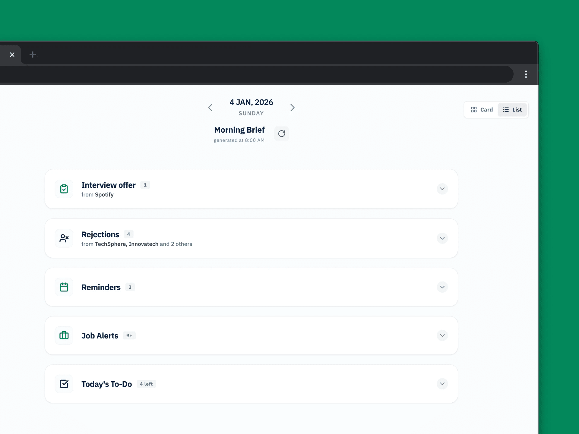
Daily Brief is a feature in Jobbox that organizes your scattered job emails into a single daily snapshot of interview invitations, rejections, follow-ups, and new opportunities all prioritized by what needs action now.
USER RESEARCH
Why tracking should help, and why it fails.
I validated pain points at scale through digital ethnography across reddit, then interviewed 8 active job seekers about how they run their searches end to end.
7 of 8 had abandoned their job trackers within 2 to 3 weeks.
Not because the tools were broken. Because manual tracking felt like unpaid work.
Users didn't need more ways to organize information. They needed someone to tell them what to do next, which would give them a sense of momentum.
KEY FINDINGS
Two places where job search breaks down.
- Manual tracking dies in 2 weeks
Every participant had tried something, Google Sheets, Notion, Huntr, TealHQ. They'd start strong, logging applications with notes and status updates. Within weeks, the spreadsheet sat untouched.
- When everything's urgent, nothing gets done
Participants received 10–30 job emails daily and tried to go through each one. But the real details like salary, location, and requirements were buried in long descriptions. Figuring out if a role was worth applying to meant doing mental math for every listing. Most days, they'd give up halfway; emails piled up, and saved jobs sat untouched.
On average, users reviewed 10 jobs for every 1 application sent. The effort to evaluate was high, the confidence to act was low, and the guilt of "what if I missed something important" was constant.
FEATURES
Here's what needs attention today
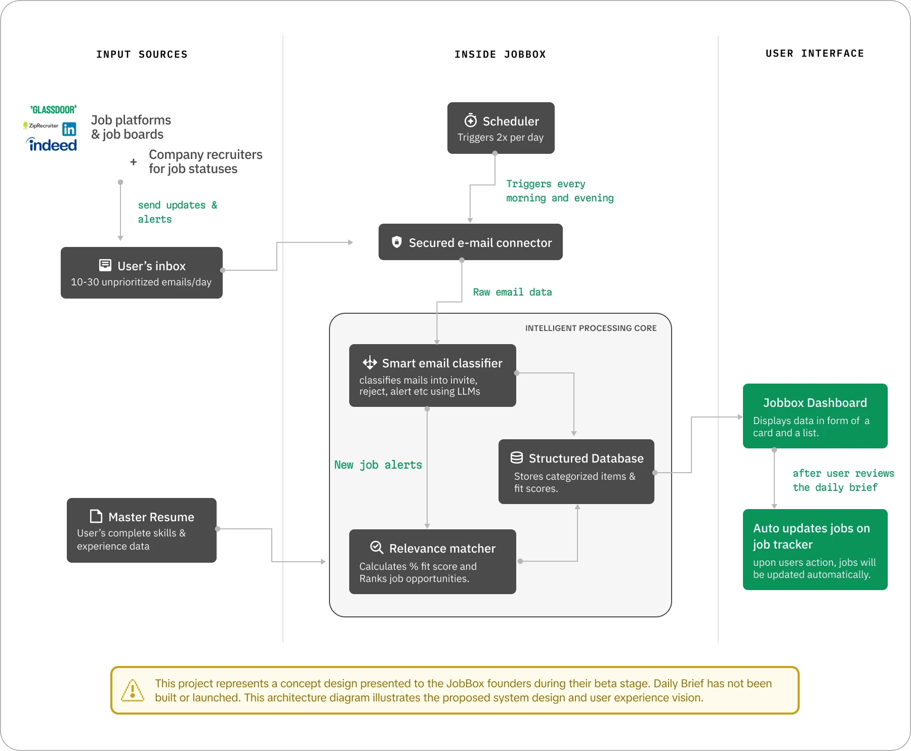
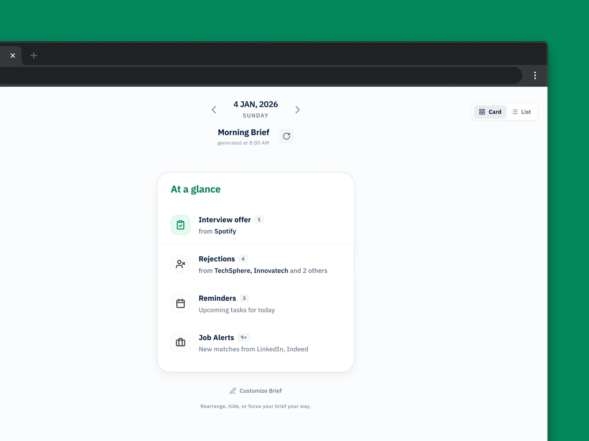
Users received 10–30 emails daily with no hierarchy. Daily Brief organizes them into categories and surfaces a summary: "3 Interview Offers • 2 Rejections • 5 New Jobs."
Tracking that runs itself
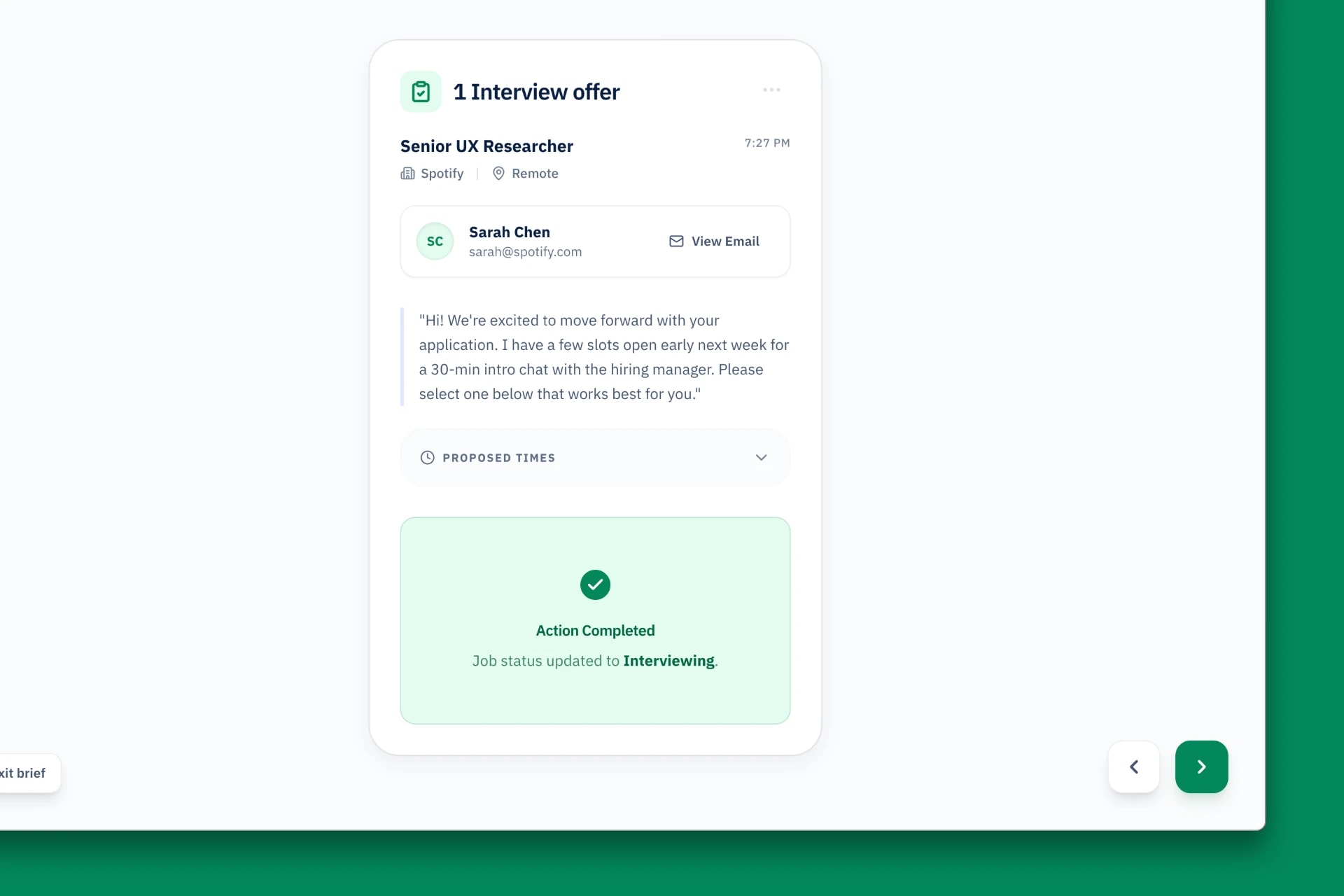
Daily Brief parses emails twice daily and auto-sorts them into stages. Users confirm what the system suggests rather than building entries from scratch.
Know if you're qualified before you apply
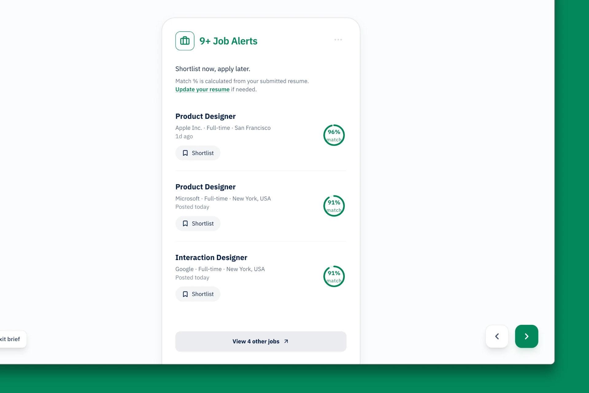
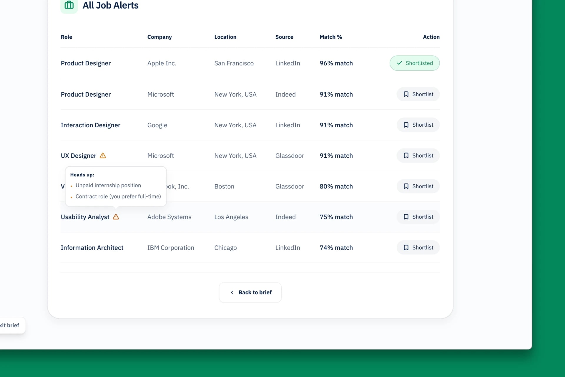
Daily Brief compares each job against the user's Master Resume and shows match percentages, so users can determine fit at a glance.
RESULTS
Hours of inbox chaos became a 10-minute session
I tested the working prototype with users. The strongest signals came from behavior, not scores:
- One tester said they'd pay for Daily Brief on the spot, unprompted. The prototype scored 4.5 out of 5 on usability.
- The JobBox founders called it polished and focused on a real need, and shared they'd been circling a similar idea internally but hadn't built it. It matched pain points they were already hearing from their users.
Based on the testing sessions, I also estimated the impact against how participants worked before:
- 70% less time sorting. Going through the day's emails took 45 to 60 minutes. In the prototype it took 10 to 15.
- 90% less manual tracking. Logging updates fell from roughly 20 minutes a day to about 2, since users confirm instead of entering data.
RETROSPECTIVE
Takeaways
- The most impactful design decision in this project was not adding a capability. It was removing noise so people could act on information they already had. Every feature that tested well did less, not more: fewer emails to read, fewer statuses to log, fewer roles to evaluate manually.
- Prototyping in Cursor shaped the quality of feedback. Because the mailbox opened, hover states worked, and interactions felt real, participants treated it like a product instead of a concept and gave sharper feedback. I got to working interactions in hours instead of days, which meant more iterations inside a four week window.