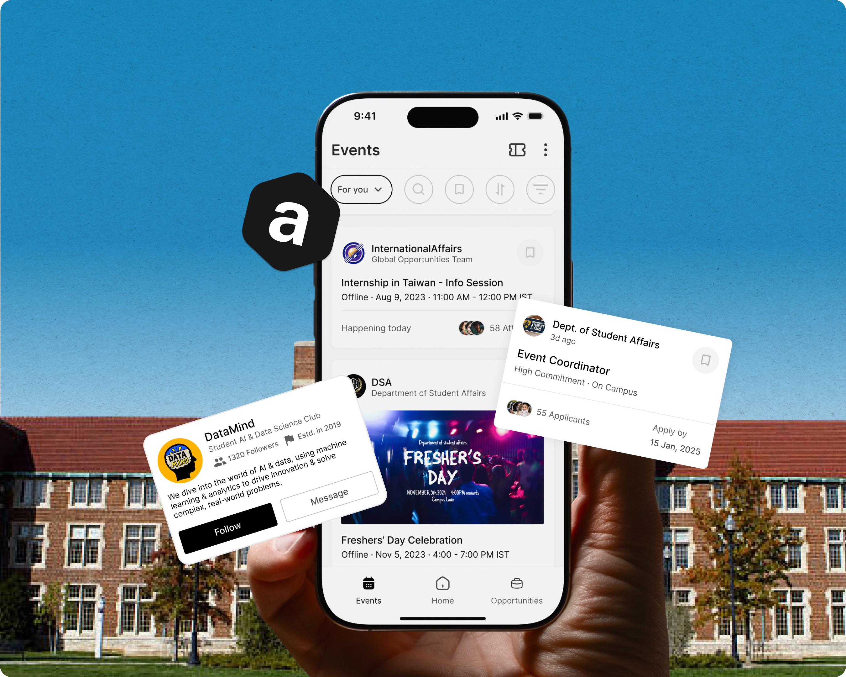
CONTEXT
The initiative
While organizing a Front-end Developer workshop at my college, I promoted it through social media, digital posters, and emails to 10,000 students. Yet, only 130 out of 3,000–4,000 Computer Science students registered, with just half attending. This low engagement led me to investigate and solve the root issues.

PROBLEM SPACE
The issue is…
Students on college campuses struggle to stay informed about club events and opportunities, leading to low participation and reduced engagement. This lack of visibility limits their ability to explore diverse interests and build meaningful connections.
Here is what I was working with
Constraints
- Time Limit: Had just four weeks to work on the project.
- Focus Areas: Worked on key flows: finding events, joining clubs, and easy registration.
- Solo Work: Designed everything solo and used simple prototypes to get quick feedback.
- User Research: Finding participants was hard, so I used quick surveys and talked to a small, mixed group of students.
Assumptions
- Quick Decisions: Being the only designer made decisions faster, but I missed early feedback, which I got later through testing.
- No Competition: Similar apps didn't exist for Indian universities.
- Learning from Others: Borrowed ideas from apps like Bluelearn, Eventbrite, and LinkedIn to make something that fit students' needs.

USER RESEARCH
Analyzing the survey results
75% of students rarely attend events or go just once a month.
82% say they miss events because they didn't know enough about them beforehand.
73% rely on online platforms to find out what's happening on campus.
78% of students on large campuses say staying informed is harder. Too spread out for word-of-mouth to work.
TASK ANALYSIS
Lost in the noise: The current state of event discovery
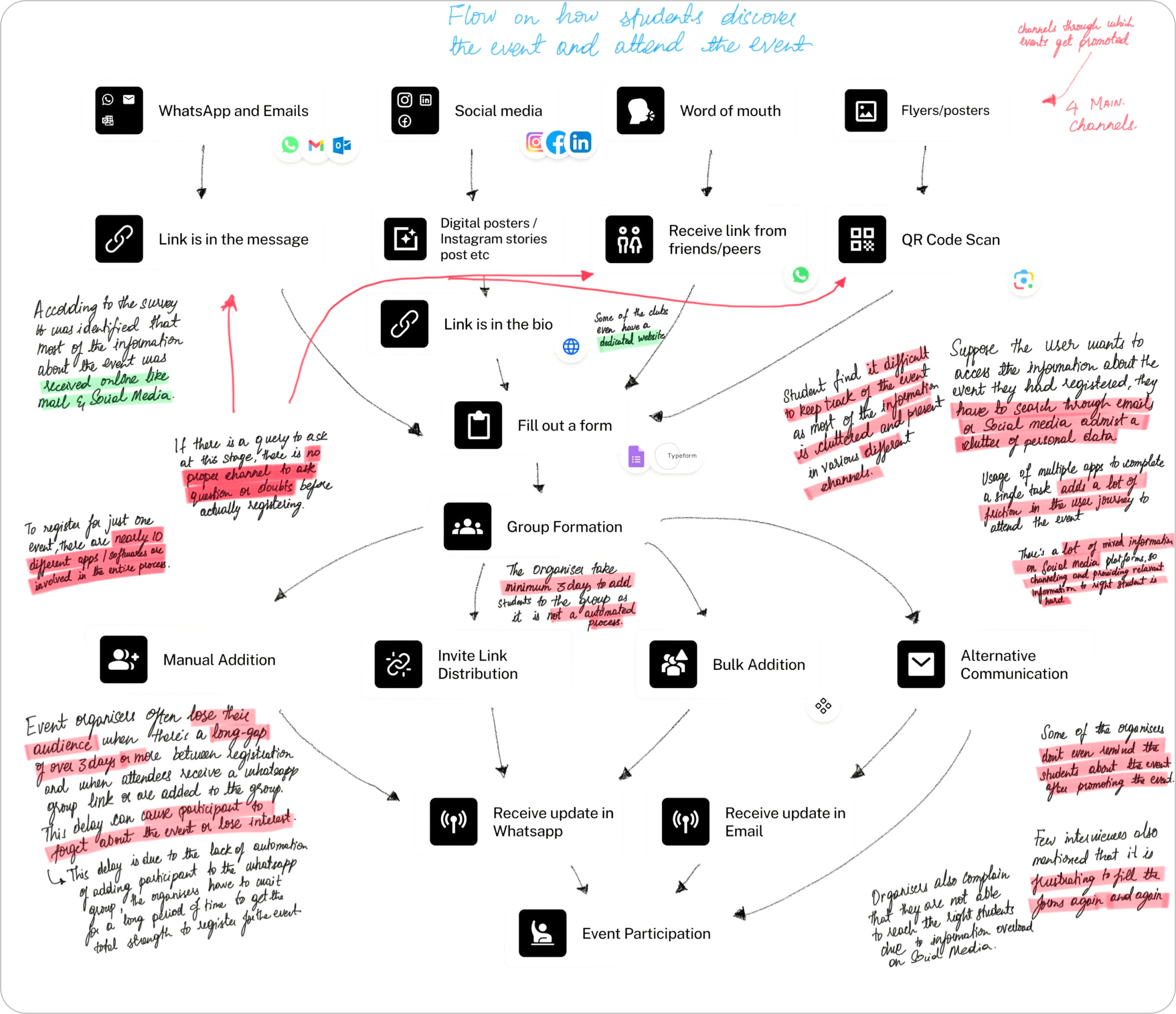
After conducting user interviews with 9 students, aged 18–23, from various colleges and different roles, I aimed to understand their process of discovering events, identify the pain points, and explore the factors contributing to these challenges. I also used a naturalistic observation method to see how students actually navigate event discovery in real situations.
Here are the key insights, along with my hypothesis that current methods are ineffective due to disorganization and a failure to meet students' needs.


Why I Named the App "Assembly"
In the Indian context, "Assembly" refers to the daily student gathering for announcements and community-building. This name captures the essence of unity and shared purpose, much like physical assemblies that brought students together. "Assembly" digitally connects students, fostering engagement around shared interests, whether it's a dance competition or a late-night coding session.
App Type & Business Model
A mobile app was the most practical choice, ensuring on-the-go accessibility for students. The app follows a B2B2C model, partnering with educational institutions (B2B) to provide a platform for students (B2C), enhancing campus engagement at scale.
Core Users
The primary audience consists of university students (ages 18-25) looking for a seamless, digital way to discover and participate in campus events and communities.
DESIGN PHASE
Design goals
Before diving into the design process, I identified key challenges students face when engaging with campus events. To address these, I set the following design goals for Assembly:
- Simple and quick navigation — The app should be easy to use, allowing students to find what they need in three clicks or less.
- Personalized and relevant experience — Tailor the app to students' interests with customized event and club recommendations.
- Seamless event participation — Make finding and registering for events quick and straightforward while helping students connect with their campus community.
- Clear and timely notifications — Provide reminders to keep students informed about their events without overwhelming them.
Getting down to business
The design phase was definitely one of my favorites. Using Figma mirror to create prototypes on my phone made everything feel real and exciting. I took inspiration from platforms like Mobbin and followed designers on X to help spark ideas for the app's layout, components, and user needs.
I also spent time experimenting with copywriting, analyzing apps that had clear and engaging interfaces to understand how they presented information. AI tools like ChatGPT and Gemini were invaluable in generating event copy and helping me refine my ideas.

EVENTS
The plus of less
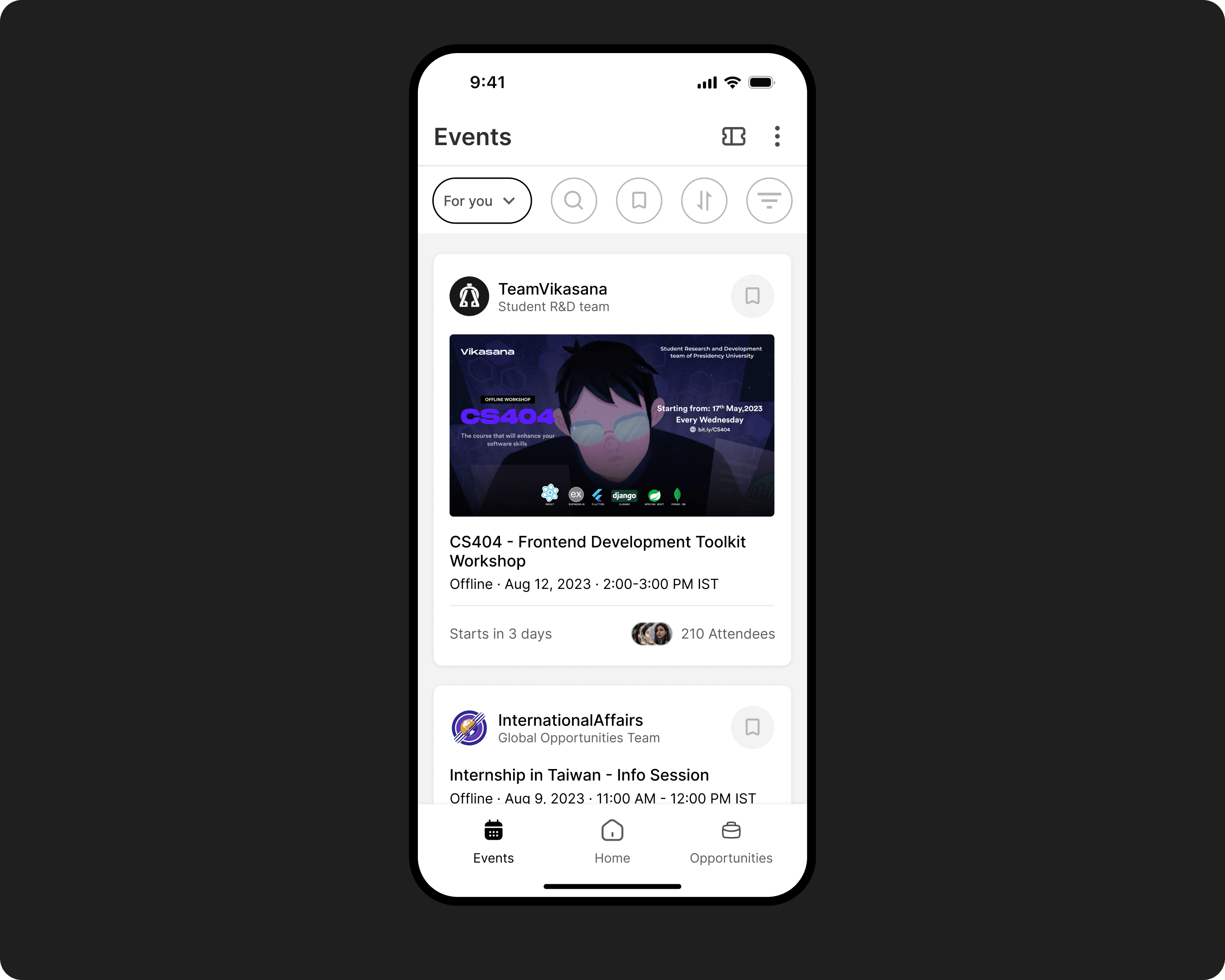
Designing the events page was the biggest challenge. It needed to be filled with features, yet simple to use. After testing the mid fidelity prototype, I realized it felt too cluttered. I had added extra options and text, thinking it would help, but it only overwhelmed users.
I quickly realized that simplicity was key. I removed unnecessary elements and kept only what was essential. I started treating the screen like real estate, asking myself if each piece of text, information, or icon truly served a purpose in that part of the flow.
The final events page is clean, focused, and provides all the necessary details in an easy-to-read format.

"Too much text!"
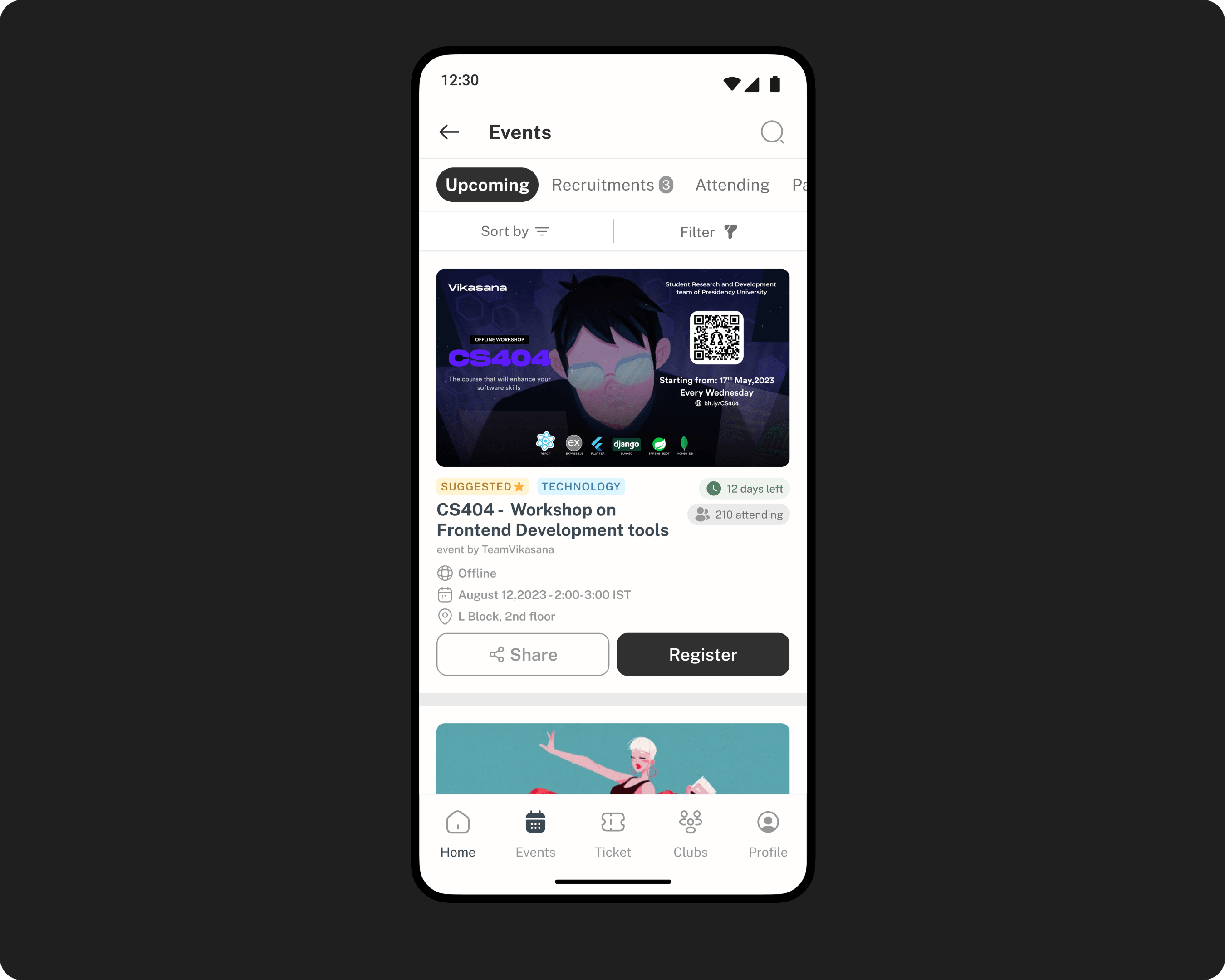
During user testing for the events page, I noticed that users took a long time to read through event descriptions. The text lacked visual hierarchy and appeared as a heap of information.
This highlighted an issue: I was unintentionally copying social media patterns, which weren't solving the real problem. Returning to my user research, I found that students had mentioned their frustration with unscannable, text-heavy emails and messages.
Taking this feedback into account, I reworked the event descriptions to make them scannable and user-friendly. I adopted a structure based on the "5 W's": Where is the event happening, When is it, Who is organizing it, Why should someone attend, and Whom is it meant for.
Event registration prototype


MESSAGING
Should I correct or assist the current behavior?
After a student registers for an event, a bottom sheet appears, prompting them to join a group to connect with peers and receive host updates.
Here's the dilemma: Indian students love WhatsApp. It's their go-to app when it comes to messaging. Now should I stick to their existing behavior and link them to a WhatsApp group, or nudge them toward the inbuilt messaging feature of the app? Pulling students from their daily WhatsApp habits to a new app felt like adding unnecessary friction.
After some thought, I chose the in-app messaging groups, believing it would encourage students to visit the app multiple times a day. Also in user interviews, students mentioned how spam in groups buries important updates from hosts, so I added two channels per group: one for important updates from the host and another for open discussions. Something no other app currently offers.
I know this might be a bit of a disconnect for some students, but we can always tweak things based on real user behavior. For now, it feels like a good balance between convenience and encouraging students to use the app more often throughout the day.

OPPORTUNITIES
A change in the hierarchy
When I started designing, I gave "Clubs" its own dedicated tab. I thought it was a core feature students would want easy access to. But after testing and thinking about how students actually use the app, I realized something: no one's checking out clubs every day, or even every month. Keeping it on the same level as "Events" or the "Home" feed just didn't feel right.
That's when the idea of "Opportunities" clicked. It started out as a small section within the "Events" page, but I realized it needed to stand out. Students want more than just a list of clubs. They're looking for ways to make their college experience meaningful. Volunteering, hackathons, leadership roles, event coordination. These are the things that matter. So, I made "Opportunities" its own tab, front and center.
To keep things clean and intuitive, I moved "Clubs" under "Opportunities." This way, it's still there when students need it, but the focus stays on dynamic and exciting activities. Now, the flow feels natural. Students can explore a world of possibilities to figure out what excites them and where they can really shine.


ONBOARDING
Straight to the action
Since Assembly operates in a B2B2C setup, we leverage the university's database for basic student details like name, department, and email. Using the college login ensures only authorized access, making the app feel secure and seamless.
Given that the app is introduced by the university itself, I didn't feel the need for a fancy, drawn-out onboarding. Instead, I kept it simple. No fluff, just a quick setup to capture preferences and jump straight into exploring events. This way, students can skip the formalities and get right into the action.


RETROSPECTIVE
Results
While the app hasn't been developed yet, user testing with 24 participants revealed an average satisfaction score of 4.7 out of 5. Most users felt that, if this was a real app, it would help them build meaningful connections and significantly enhance their campus experience.
Lessons learnt
- Iteration in the design process — Every round of testing brought new insights, leading to small but meaningful changes. It was a constant reminder that great design doesn't happen in one go, it's built through iteration.
- The value of design critiques — Getting feedback from experienced designers opened my eyes to issues I wouldn't have caught alone. Their input didn't just improve the design, it saved me a ton of time and effort.
- Designing without existing solutions — Without clear competitors to learn from, mapping out user flows was tricky. Looking at similar platforms gave me some direction, but it pushed me to think creatively about what users actually needed.
- Overcoming creative blocks — When I felt stuck, stepping back to revisit the project's main goals always helped. It reminded me why I started and gave me the clarity to move forward.